Thursday, September 22, 2011

The problem with...

... going paperless... is that there's nothing like a good scribble on a piece of paper to get your thoughts together.

Actually, that's far too simplistic, but I have been trying my hardest for the past couple of months to go paperless.  The 'going paperless' tools I've been using are as follows:
1.  PC
2.  MacBook Pro
3.  iPad
4.  iPhone
5. HTC Desire

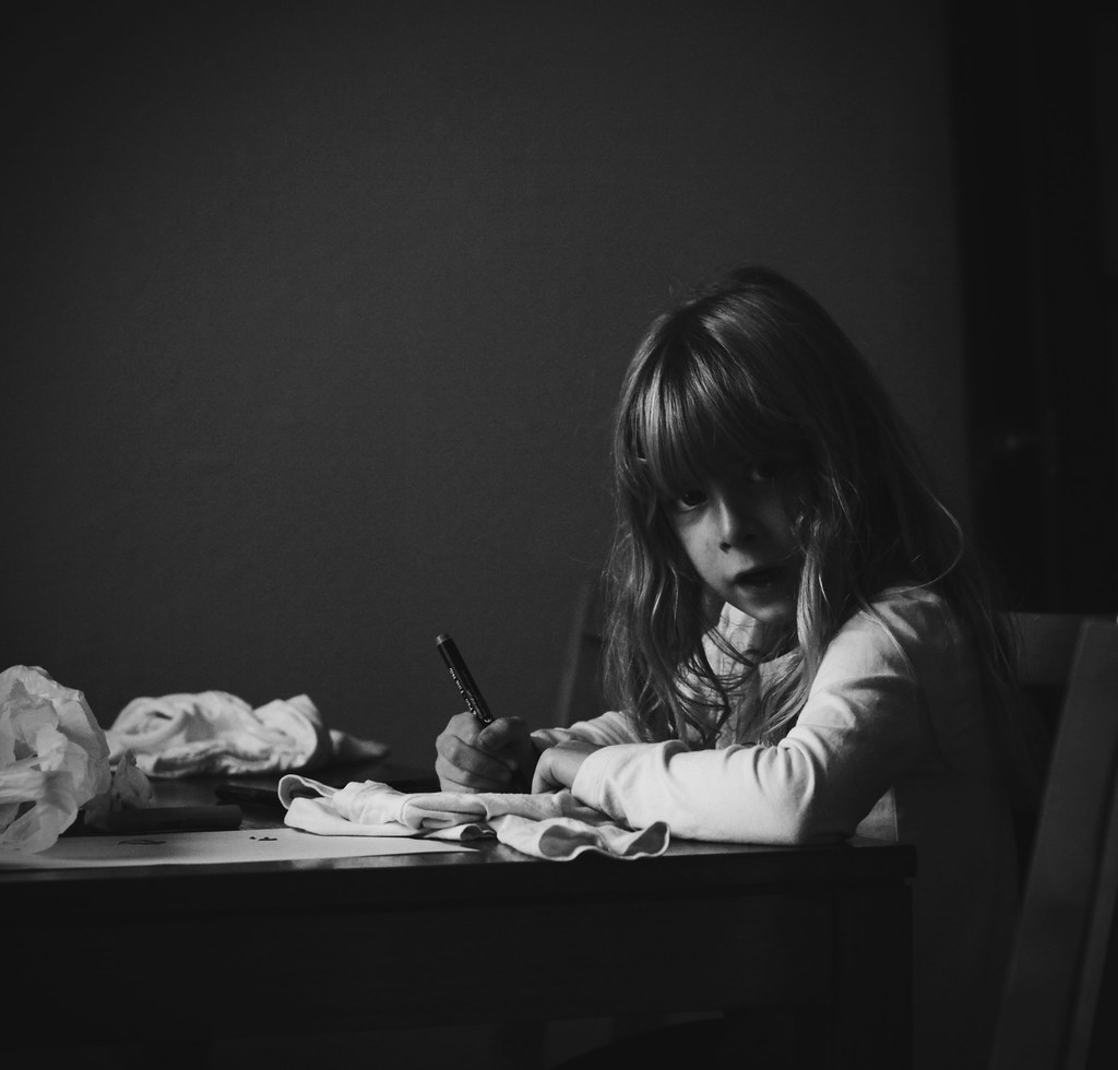
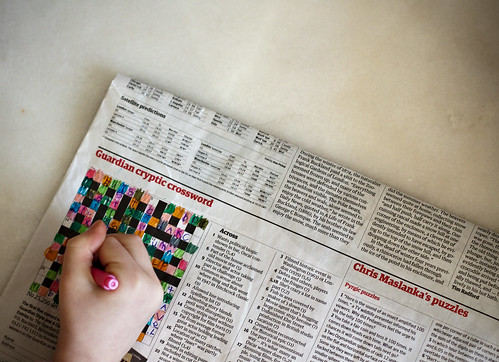
Now, as I said above, I do love a good scribble on paper.  And I'm also one of those people who write 'in hieroglyphics' (as other people tend to describe it!).  In other words, I can do shorthand.  As a result, the gap between an idea or a comment entering my ears and onto paper is very very small.  I'm also a bit of a soft systems person too.  Present me with a complex problem and within minutes you'll be laughing at my stick people (who always have bobbly feet), lines, arrows, thought bubbles as I get to grips with trying to understand what I see in front of me.  I can spray diagram my way out of most situations quicker than you can say 'the exit's over there you can stop doing a spray diagram now...'

Going without paper was tough.

Very tough.

The first few weeks of not using pens and paper I physically had to stop myself from taking a notepad around with me.  Instead, I diligently noted everything down in Evernote which, after a lapse of a couple of years where I didn't use it, I've been enjoying rediscovering its loveliness.  From pictures to audio to text and more, it sat happily on my PC, MacBook, iPad, iPhone etc... waiting for notes to head its way.  And it's been great.  However, the funny thing is that note taking on an iPad, for example, requires a different level of concentration to just taking shorthand notes.  With shorthand I don't have to think about how I'm recording what's being said.  It's the difference between listening to words being spoken and hearing the letters read out of a word you have to piece back together.  You just listen.  With the iPad I found that part of my brain became disengaged as I struggled to touch type with no physical keyboard.

Eventually, this worked okay - my spelling became atrocious, I hated the shift key and its location next to the letter 'a' and auto-correct produced plenty of on-screen comedy for me to sort out later.  But it worked.  But I still wasn't listening in the way I'd listened before.

I could spray diagram, but instead of drawing, scribbling, adjusting and annotating as before, I had to glue spray diagrams together.  The bubbles wouldn't behave themselves, moving about the screen with a steely determination to thwart my order.  Eventually, they would look pretty and presentable - but you know what?  I could have done that before.  Sketching things out roughly using my pen and pad, and then putting the next draft into whichever mind mapping tool did most of the things I wanted.  The software inhibited my thinking by conforming it to the order *it* imagined I was after.  What was quick and dynamic became laboured and laborious.

What else went paperless?  Well, my 'to do' lists also went electronic.  My habit of sitting down first thing and creating the day's to do list in my notepad disappeared and instead, I added tasks as I went to my Google Tasks.  Actually, this has been a goodie in lots of ways.  I can link things to my Google Calendar... can create tasks from emails within Gmail.  Yup.  It's worked nicely.  Especially since Google Apps landed at both of the institutions where I work.  But there's something about physically creating a list and physically crossing things out which a little click doesn't capture.  Isn't that sad?  The 'all ticked off'  satisfying flourish of a pen across the list as another item disappeared.  Sanitised *clicks* as my 'to do's' became 'to done' wasn't quite the same.

I did, on the other hand, love Dropbox even more than before as my notepad... sorry... iPad... moved from being simply the here and now (and a few scribbles before), to being all of that and my entire filing system and document store as well.  Plus, syncing between multiple devices was easy.  And the joy of not having to lug a stack load of meeting papers across the campus was something to treasure!

So... where am I now with paperless?  I have to admit (and given that the image above was me diagramming a problem just yesterday!), that I'm in 'compromise land'.

Going paperless is perfectly possible.  Going paperless is great.

Going 'almost paperless'.. well... that works much better for me. That said, shorthand seems to be a dying art and diagramming will become much easier as software becomes increasingly fluid and user-centred.  I can see a (nearly) paperless future.  Even for me.  My petty issues, such as they were, will be non-issues in the future.

Yet... there's nothing like a good scribble.

Sunday, September 18, 2011

On bullet points...

Most people who know me will have heard me give them the 'I hate bullet points' monologue when triggered.  Those who've worked on a presentation with me, may have had the experience of me un-bullet-pointing a presentation we'll be delivering together.  Brutally.  Not in a mean way - but it would take a *lot* to persuade me that a presentation should have bullet points in it at all.  And if they are there, they should be minimal and contain only the key points expressed succinctly enough that they could be written on the back of stamp.

What's wrong with bullet points, I hear you cry (well, possibly you're not bothered either... but if you are, here's the problem with them) - they make you read out what's on the slide.  That sounds a weak argument, doesn't it?  But the moment you start reading from the slide, you should sit yourself down, distribute the handouts and invite your audience to peruse those instead.  It's a presentation, not a book group.

I've seen people turn their back to the audience and read directly *to* the bullet points in front of them.  I've attended presentations where the entirety has been someone reading the thing out... bullet point by boring bullet point.  Or, one of the worst I attended where someone managed to cram 28 separate bullet points on the same slide... and helpfully said 'I doubt you can read these' as they then read every single one out.  Not good.

The other thing that bullet points do is that they restrict your flow.  Instead of the presentation flowing from start to finish, it becomes a race with hurdles which you must jump to progress to the next slide.  Miss out a bullet point and people wonder what happened.  Even if you don't specifically mention the bullet point, you feel obliged to say 'I'm skipping that one' or a variation on the same.  But what if as you're presenting you realise that your audience needs more or less of what you're saying?  The bullet point hurdles sit, obstinately on screen... refusing to budge... and force you to clamber over each and every one.  They don't let the presentation breathe or respond.

So, my manifesto for presentations...

1.  Remember you are presenting - the audience is there to hear and see you.
2.  Your slides are in the background.  They are not the presenter.  You are.
3.  Think of slides as visual punctuation.  They accent points.  They highlight specific elements.  However, like all punctuation, they are not there to provide the substance, they are there for structure.
4.  If you find yourself reading out your slides, you've got it wrong.  Watch out for these moments and make a mental note to yourself to sort it out.  If your audience has to wade through reading them, then they aren't listening to you.
5.  If you're going to use images, really use them.  Don't be too literal.  Don't distract.  Don't go for cheap laughs (unless that's what you're after!).  Think about what you want the audience to feel.  Think about how visuals might help you emphasise your point.  Think about where they're placed.  And when.  And what size.
6.  Less is more.
7.  This doesn't necessarily mean less slides though.  Two or three words per slide to make specific points can be flipped through very quickly as you speak - which might well mean more slides than normal.  This is okay - think of it as a process of animation.  Lots of frames to make one moment of animation.  If I'm displaying data, I may have several slides to build up the chart so that each element I want to focus on has space.
8.  If you're starting to prepare a presentation don't start in PowerPoint.  Get the framework planned first before you go near something that might force you into thinking in bullet points.
9.  If you really want bullet points, put them in the notes section of your presentation.  They're for *your* benefit.  And if other people want to have access to them, share the presentation with them afterwards.
10.  You don't need bullet points if you know what you're talking about.  A good presentation takes time.  And practice.  And thought.  But all the thought that went into it, means you don't need all those bullet points.  They're a safety net which prevents you from really talking with your audience.

Oh, and the irony of me presenting the above as a numbered bulleted list doesn't escape me.  But this is okay - you're reading this.  You're *meant* to be reading it.  If I were presenting it, you'd probably get about 10 slides with images and me making each of the points in a range of ways!

Friday, September 16, 2011

Getting going with CMALT

Since I've just written up some advice about starting CMALT for another audience... I thought I might be lazy and turn it into a blog posting too. Here goes...


If you're trying to make a start on your CMALT portfolio then there are a few basic hurdles to jump first. 


Hurdle 1. Making up your mind to do it!
I first looked at CMALT several years before I did anything about applying. Why, I don't know - but it sat in the background for a very long time and it was only once I actually made up my mind that I was going to do it... and gave myself a time frame to complete it by... that I made a start.  


Hurdle 2. Deciding how you're going to present your portfolio.
What portfolio will you use? Now, while it really is a free choice for you (and if you have something you'd rather use, provided it can be accessed by the assessor, then whatever would be fine), if you want a quick start then the Google Sites template I created a while back should kick start things. There's a YouTube video on how to use it at http://www.youtube.com/watch?v=KI324MW3dgk and once you've done that, you can use Google Sites - either from your own Google account or from within Google Apps if that's available at your institution - to create the basic outline, complete with instructions on each of the the requirements. 


Hurdle 3. Starting to write it once the framework is in place
I found that completing the basic stuff got me going... then I put a single sentence for each section which captured the essence of what I might cover just as a place marker and to get me thinking about what might be needed for my description / reflection. Even if I didn't end up writing about the thing I first thought I would, this really helped me move forwards with the process of getting it completed. 


Hurdle 4. Gathering evidence
Now, some of this is made easier by the 'right' choice of description. Don't write about stuff from 5+ years ago because a) the relevance would be questionable unless included for a very specific reason (i.e. a qualification) and b) getting the evidence after that gap is very hard! Make smart choices with step 3, and step 4 is easier. 


Hurdle 5. Getting feedback.
I didn't have anyone else at my previous university who'd done CMALT so had no opportunity for feedback at all* - but I really would have appreciated it. To get around that, I gave some friends from other institutions the address of my portfolio and asked (begged!) them to take a look for me. This gave me confidence and helped me make the tweaks before I submitted it. Alternatively, sharing the address of your portfolio with colleagues internally would also be helpful, as would 'buddying up' with someone to work on it together. The more visible your portfolio is, the more obliged you feel to get something done! If it can be hidden and forgotten... it is hidden and forgotten! 


Hope those give you a bit of a help with getting started! Oh, and if you want to see an example of a complete CMALT portfolio, then mine is online at http://sites.google.com/site/sarahhorriganportfolio/. It's not the best, it's not the worst - but it did pass, so for what it's worth... it's open and shared!


* There is a CrowdVine CMALT site which you can access once you register for CMALT, but since a lot of people get started before they're registered, feedback can still be tricky!

Thursday, September 8, 2011

ALT-C 2011 - Wordled...

Being a curious soul, I decided to Wordle the tweets I'd done during ALT-C 2011 to see what key themes or words emerged.  Interestingly, tech balanced evenly with learning... and noticing the prominence of my 'elearningbingo' tag* in there - it's clear that there's still a fair bit of jargon kicking around.  What is good though is that there isn't tons of mention of particular tools - things that stand out are education, change, need, listening, interesting, teaching, students, good, talk - and these are far more important than the technical specifics.

Possibly that's what my ear is listening out for!  But, a lot of going to these things is filtering to get to the heart of what will get you thinking and moving forwards.  Making connections between ideas and having that moment of pause which is so important.

Anyway, off for a mull (and a sleep!).  These things sure are tiring!

* I play a game with myself when I go to events - listen out for the jargon / buzzword / phrase of the moment and play bingo with it.  The main culprit at this conference was 'doing more with less' - which is a nonsense statement.  Less what?  Enthusiasm?  Interest?  Joy?  Engagement?  Of course not.  Tarting up 'budgets have been cut and you have to deal with it' is fine... but we shouldn't lose sight of the fact that we're still in this to improve and expand the learning opportunities of others (and ourselves).  Rant... out.  :o)

So... about ALT-C 2011...

Not long now until ALT-C is done for another year. This year has involve schlepping up to the University of Leeds... a city which has fully delivered (in terms of the weather!) on the promise of it being grim up North. Three days of rain and gales but as ever some thought provoking stuff to take away... some slightly depressing stuff to take away... and some stuff which fell neatly into the 'well, that was odd category'. But all good in many ways.
 So... let's tootle through the good, the bad and the weird.

Good
Hearing about the one laptop per child (OLPC) project in Uruguay from Miguel Brechner was a little dose of inspiration to start the conference. It was clear from the presentation that the impact of technology when it breaks free and into the community is powerful and exciting. It was also clear that the dogmatic insistence on 'traditional teaching and practice' which appears to be the current governmental message in this country would never have helped achieve the 100% laptops for state school children in Uruguay... or given them the freedom to try and take risks... and to invest where needed. I was taken aback when someone from the audience asked Miguel, 'what can we in the UK do to help with the project?' and the thought that they need to learn from us when it is they who are making such a dramatic change to communities and lives is odd to say the least. I get where the spirit of the question was coming from... but the opportunity to learn and grow together across boundaries didn't seem to be the message there.

Other good stuff? As ever... meeting up with old faces, new faces, even faces dressed like a cowgirl (waves at AmberThomas) and share practice, ideas and experiences. Things I've learned about learning technologists? They like wearing checked shirts. They drink *lots* of coffee. They're either implementing new VLEs or in the process of doing so*. They're regularly the subject of structural change wherever they're based. Okay, so I knew most of this stuff beforehand... but the checked shirts thing is good to have confirmed. :o)


Bad
Some really dreadful presentations. Again. I say this every year but... stop with all the bloomin' bullet points. Please!!! If I come to hear you talk... I come to hear *you* talk. Not read your boring, Arial font, bulletpointy, over-full slides whilst trying to keep up with what you're saying. I really wanted to go to some of the petcha kucha sessions with their visual, short, snappy brief - but couldn't due to clashing commitments but it's definitely a format I'm keen to try in the future.

Other bad stuff? Some, and I'm sorry to say it, not great workshops. Not all weren't great, but too many had no plenary... no sense of purpose... and weren't always related to their theme.

Also not good - sponsor sessions disguised as invited speaker sessions. I was seriously irritated by the Blackboard Collaborate session which showed glossy American promo vids and promoted the main benefits of online working with two thirds about cost savings / income generation. Talk to me about the pedagogy. Talk to me about the process. Talk to me about real things Don't flog me your system unless I want to hear about it.


Odd stuff
Several rooms which bordered on the sports hall school of surreal - now, this sounds petty but as someone with tinnitus I have a real problem with echoey venues and this echoed with the best of them. Especially on the morning where a high pitched squeal accompanied the space. Also, rooms which didn't fit the number of participants. There has to be a better room allocation system even though I'm aware that this is a lesson in complexity and then some! Also, vegetarian catering. One option for veggies which had 'had an accident' so we ended up with lettuce and coleslaw! Nice work people!

Ermm... That's it for now. Will write up more specific stuff later. Another talk beckons...

PS  It's always a gargantuan effort to get these events off the ground and that's always appreciated and firmly on the 'good' list!

* this one should be on the bad list.  When implementing a new technology prevents you from having the time to look at any other learning and teaching practice / innovation / technology then something's amiss.  VLEs are a huge time sink for learning technologists and I hope that this starts to change in the next few years...

Monday, September 5, 2011

Help me develop my online course...

I was chatting to someone earlier today about the sorts of things involved in producing an online course and in sharing our experience it seems there are 10 common areas which crop up when you're involved in projects like this.

  1. Project management skills aren't necessarily the ones possessed in academia!  You'll need these to get it from conception to completion.
  2. The gap between design, reality and delivery can be huge - someone needs to take on the job of helping to close this!  It's probably going to be you.
  3. Going from face-to-face teaching to online teaching can be scary - it's important to cut people some slack and find multiple ways to support them in developing skills and confidence
  4. Don't wait until the course goes live for teaching staff to acquire online teaching skills - developing an online course isn't just about content.
  5. Be clear about the objective and get it communicated clearly too - establish what it is you're after early on as being pulled off course by new additions / other agendas / misplaced priorities can be fatal.
  6. The moment someone says 'we'll just put the PowerPoints online' should set off alarm bells in your head.  Establish your definition of what counts as online learning early and allow these conversations to air sooner rather than later.
  7. Give yourself enough time - it isn't quick, it isn't easy, it isn't cheap.  Counter the myths and be realistic - or you'll spend the month before the course is due to be delivered going grey.
  8. Inactive content is dull.  If people need help with activity design, alignment and active learning... support them to get there because it'll be worth it.
  9. Aim big if you want, but start small - testing a small sample of content on a willing group of students and taking on board their feedback is much better than hiding away and developing the whole lot... then discovering it's rubbish.
  10. Establish a visual style guide at the outset - templates, models, examples etc help those new to online course creation - and enables you to produce a consistent look and feel to the materials.  For fully online courses, the online content *is* the University!
So... how to do it?  Well... there's lots of stuff out there, but some places to kick-start your thinking might include:
  • Professional Development Framework for e-Learning to help give you an idea of some of the skills needed as well as checklists etc for the production of online learning content
  • Some nice design ideas from Articulate especially if you're after some 'fancy bits' to tart up a text-heavy course
  • The ADDIE design approach is also useful in establishing key tasks in producing an online course and this is explained in a simple-to-get manner by Intulogy.
  • The Design Studio from JISC is jam-packed full of resources and ideas and the curriculum lifecycle is especially helpful when you're starting out.
  • JISC Infokit on Project Management is a good place to help you with the Project Management side of things and the checklists are dandy!
  • Open University Learning Design Initiative is one to watch as the  resources and links to Cloudworks are great for activity design 
Oh, and the other thing to realise when someone asks you to 'help me develop my online course' is that as much as this seems to *just* be about something academic and / or technological... it's about people and communication.  Don't fall into the trap of thinking it isn't!
Related Posts Plugin for WordPress, Blogger...